
Colors, not even afraid!
-
 by Maeva
- 09/01/2022
- Decoration
- 0
You have 5 minutes (stopwatch), time for a coffee… Take a seat on the sofa and let’s talk about the first of ParisHomes’ secrets: how to put color in your accommodation!
Did you know ?
According to a study conducted in 2018 by the American company Gallup for the Institute for Research on Happiness, housing is one of the key factors of happiness. To be honest, it would even come well before money, health or work.
In short, nothing beats feeling good at home and that goes through various elements including the feeling of pride.
If our accommodation is comfortable, beautiful and in our image then we feel good at home.
Did you say “beautiful and at your image”? This is precisely where decoration comes into play and in particular… colors.
What colors for his apartment?
Rule number 1: All tastes are in nature
In terms of colors, the choice is not lacking and if you are wondering what color can be put without making a false note in your home then the answer is simple: all the colors of the “visible spectrum”.
The visible spectrum is a learned expression to name all the colors that are perceptible by the eyes: purple, blue, green, yellow, red, orange . The first 3 (blue, green, purple) are so-called cold colors and the last 3 (red, orange, yellow) are called warm. Black and white are considered the absence of color but of course it is possible to use them. This will most likely be the case with white in particular.
So they can all be used, the whole thing being to select which one to put on the wall, depending on the rooms.
Rule number 2: Divide and Rule
First of all, let us say it, there is no absolute truth. The choice of colors in your home is not an exact science that does not tolerate any deviation. Nevertheless, in terms of recommendation and based on our experience, colors can be selected depending on the use of the room . So we will tend to favor cold colors in rooms that are intended to be relaxing (shower, bedroom, etc.) and warm colors in living rooms (living room, kitchen, etc.).
Rule number 3: In reality, there is strength
Beyond the brilliance of a color , it is often the play of contrast that gives personality and strength to an interior. So, before covering all the walls with one and the same color, let yourself go to the games of opposites or complementarity. The rendering, although more daring, could only be more attractive. Choose your dominant color and add touches of other colors to highlight it!
Rule number 4: trust yourself
After all, who better than you to know what makes you happy?
You will understand, if you choose to brighten up your interior with colors then the least you can do is have fun. The objective is above all to please you and this is how your personality will emerge.
After all, each to their own, it is important to trust each other and have fun. Accommodation is personal and tells a story. Your story, no one knows it better than you. So, when choosing the color (s) for your walls, first of all, choose the ones you like. The goal is to get up there happy to live there day after day , satisfied with the environment in which you are and feeling in harmony with your interior.
For the little anecdote:
Obsessed by the idea of putting green in an apartment, we were also afraid of a garish rendering and it was only when the 4th apartment “ the elegant green ” was created that we finally took the plunge. On the wall, on the chairs, in the cushions and even in the cutlery… what do you say?
Color in all its forms
When we talk about color in a home, we tend to limit it to the walls, but the color contribution can be found in all the elements of an interior and this is the charm of the thing.
A home can therefore look and look very colorful while having white walls, it suffices for the color to be found in the furniture, decorative items, etc.
A simple example: houses in the Cyclades …
Have you ever taken a tour of the Santorini island side? Beyond, the good weather, breathtaking landscapes and all the imaginable reasons to go there … there are also these magnificent houses with walls entirely made of white lime (color chosen because it reflects the rays of the sun and allows to preserve the freshness inside) but once inside it is very often fun collection of colors in the furniture …
Idea number 1: Dare the colorful sofa
Star furniture in the living room, the sofa is an element that should not be missed because it is enthroned in this room and life revolves around it. So why not dare the color on this item?
Yellow, green, blue, if your interior is white it will stand out and immediately give it character in addition to the shape of course.
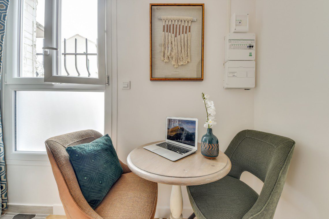
Idea number 2: go for colorful cushions
This is an ideal element to play with shapes and colors in your home.
They bring that little extra soft touch to the sofa, the armchair, the bedroom bed, in short wherever you want a feeling of comfort, the cushions add this little touch and the advantage is that it there are all colors. Something to make people happy!
For the little anecdote:
The 2 apartments located in the city of Colombes have more than ten cushions… When you love, you don’t count!
Idea number 3: feed your decoration
In decorative items, indulge yourself. Colors are everywhere!
In the green plant in the living room, on the table that sits above the headboard in your bedroom, in the pendant lights above your bar… And then finally, what is decoration, if not everything to which you have decided to give this use. That leaves an infinite number of possibilities…
Colors at ParisHomes
At ParisHomes we made the choice to create universes and sensations around colors. To play with them to make all interiors cheerful, bright and unique.
This is reflected in particular by the choice of a dominant color affixed to certain walls and which is found in spurts in the decorative elements.
The colors are present, visible but without taking the ascendancy in the accommodation. They aim to create an atmosphere but the rest of the story is you who imagine it , design it and experience it during your stay.
After all, even if there is a symbolism of colors, we remain on a very personal theme.
Basically, if orange doesn’t inspire warmth in you, red doesn’t evoke ardor for you, or green isn’t elegant in your eyes, you have the right to do so. Who are we to contradict you, the important thing is the sensations you will feel during your next stay with us …
So, see you soon and look forward to sharing other secrets with you!
Join The Discussion